Task 1:
Researching logos:
- Symbols – A word or image used to represent a specific thing, ie, a smiley face means happiness/being happy.
- Logos – a symbol or other design either created or adopted by an organisation to identify itself.
- Signs – A gesture, action, or image used to convey information.
- Corporate Identity – A visual statement that represents an organisation
- Semiotics – The study of meaning-making, the study of sign process (semiosis) and meaningful communication. (google definitions)
Researching existing logo:
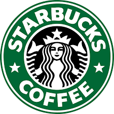
- Company: Starbucks. Starbucks is a popular coffee chain founded in 1971. They serve a variety of drinks other than coffee and realise limited drinks during certain times of the year, like the pumpkin spice latte which is only available in autumn.
- Target audience? People aged 14-40
- What kind of imagery and fonts do these names suggest? The font is bold and capitalised making it in your face and easy to read. The reason for the name ‘Starbucks’ is because the iconic Starbucks female is a mermaid, Starbucks like starfish
- Does the name suggest an informal or formal approach? The name suggests a relaxed and informal approach as the word star is not associated with formality. A more informal approach makes a company less intimidating, especially when it’s product is aimed around a sociable activity, getting coffee.
- Colours? White, black and green
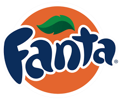
- Company: Fanta. Fanta is a brand of fizzy drinks that was created by The Coca-Cola Company in Germany, 1940, as an alternative to Coca-Cola.
- Target audience? 13 year old and under due to the bubbly font and bright, bold colour palette.
- What kind of imagery and font do these names suggest? The orange circle represents an orange (the colour changes depending on the drinks colour and flavour) and the leaf is used to enforce the fact that the product is fruit flavoured. The cartoon orange and bubbly font further indicates that this product is intended for a younger audience.
- Does the name suggest an informal or formal approach? The name Fanta suggests an informal approach as Fanta is now associated with the word fantastic. The font type also shows an informal approach as it looks fun and bouncy.
- Colours? Orange, blue, green.
Designing a logo for one of the following
- Midwest, a high street bank
- Miracle Pictures, an independent television production company specialising in religious programming
- Green Goddess, a vegetarian café
- Fireworks, a web design company
- D. Carruth & Sons, a funeral directors
- Dislekzya, a rapper
Sketchbook work:
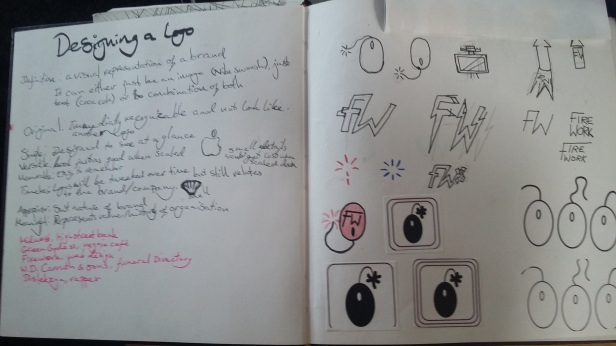
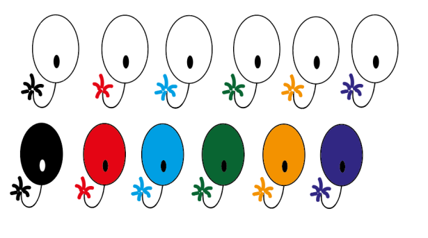
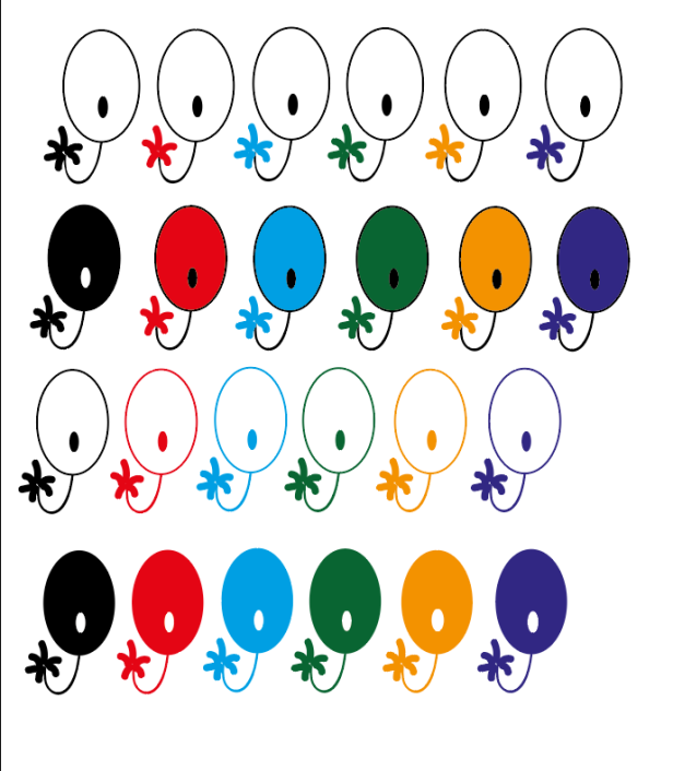
The final is top left design as I prefer the two borders compared to one, none or more. The multiple colours means you can change the logos colour so it suits your websites theme.
- Mind map ideas – mind mapping for these task was more just drawing what came to mind for the chosen companies.
- Who is the target audience? 30 to 48 year old white men, this may be a biased target audience as all our teachers have been middle aged white men who only knew about web design and nothing about animation or games.
- What kind of imagery and fonts do these names suggest? The name Firework suggest something explosive but the companies purpose brings professional imagery or font.
- How might they be combined for maximum impact? By creating a professional logo but shows something explosive to represent fun.
- How literal should you be in your interpretation?
- Do the names and/or organisations suggest a formal or informal approach? The name suggests an informal approach, but the name itself has nothing to do with the output, which means the logo has to not only show the product but also its brand name.
- Does it look too much like anything else? It looks like a computer mouse but that’s fine as it is a web company.
- Which colours, and why? No colours selected colours as this makes it transferable.
- Will it scale? Yes.
- Mind map ideas – mind mapping for these task was more just drawing what came to mind for the chosen companies.
- considering the following issues:
- Who is the target audience? Young-adult, mainstream women.
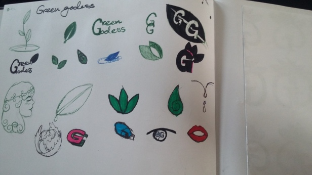
- What kind of imagery and fonts do these names suggest? The name Green Goddess automatically makes you visualise the colour green and green is used to represent life and health. Goddess suggests female imagery and elegant font.
- How might they be combined for maximum impact? They can be combined to create an elegant yet informal logo showing professionalism and a friendly environment. The logo shouldn’t need to have the colour green for it to show greenery, e.g. leaves.
- Do the names and/or organisations suggest a formal or informal approach? The name Green Goddess suggests an informal and relaxed approach which is positive as it is a cafe and they should have a relaxed and friendly atmosphere.
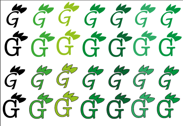
- Does it look too much like anything else? It just looks like a G with leaves above it, nut if you take the colour way the leaves kind of look like a crown/tiara which is happy coincident as it fits the Goddess half.
- Which colours, and why? Green because the organisation is called Green Goddess
- Will it scale? Yes.
Task 2:
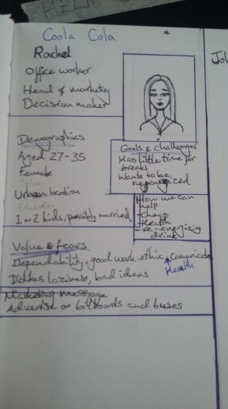
Target audience, persona and scenario. You will research the target audience as well as a persona and scenario for one of the following products:
- ‘Chillax’ – a men’s bubble bath
- ‘Coola Cola’ – a luxury, organic cola
A persona is a consumer archetype-persona writing should be based on research, rather than assumptions, to prevent you from projecting your own goals onto the audience
A scenario presents a plausible explanation of how and why the persona could be first attracted to the product.
Task 3:
Idea Development:
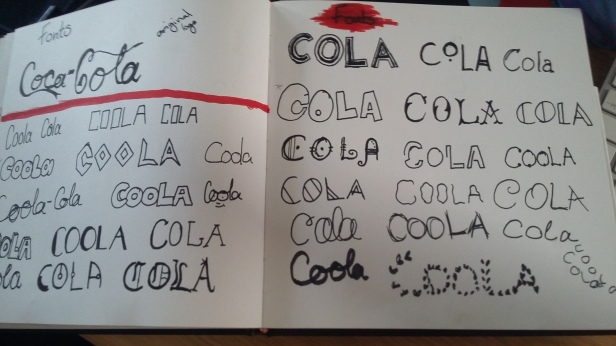
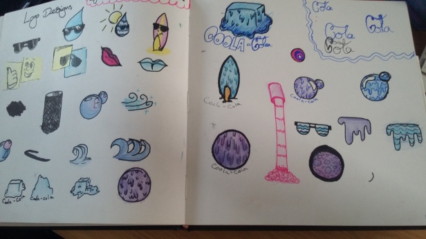
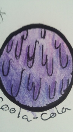
You will begin to research and develop the visual identity of your product.
· Research (collage, drawing etc.) with annotations
· Rough designs for your bubble bath/cola packaging, including a logo
Task 4:
Final Piece and Evaluation